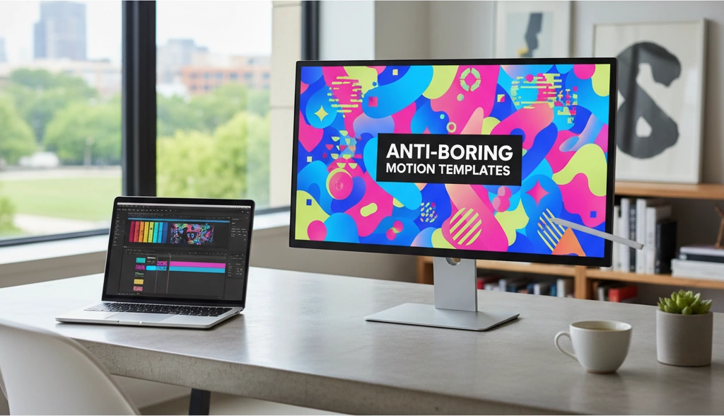
Learn expert tips to fix boring motion graphics with After Effects techniques templates and Vast’s free resources for dynamic designs.
Diagnosing Boring Motion Graphics
Let’s be honest: you can feel boring motion the second you hit play. The design might be clean, the logo might be expensive, the colours might be on‑brand—and yet the animation just… sits there. If your work looks technically “fine” but doesn’t feel alive, this is the problem you’re fighting.
In my own motion shop, this is the number one thing clients complain about (usually in nicer words):
“It feels a little flat…”
“Can we make it more dynamic?”
“It looks like a PowerPoint transition…”
If you’ve heard any of those, keep reading.
What Makes Motion Graphics Feel Boring?
Boring motion graphics usually have the same symptoms:
- Everything moves the same way
Same speed, same easing, same type of transition on every layer. - No clear focus
Your eye doesn’t know where to look first. The whole frame feels like a slideshow, not a story. - Predictable from frame 1
You can tell exactly how the next 5 seconds will play out. No surprise, no rhythm, no contrast. - Emotionless movement
The timing and spacing don’t match the message. A high‑energy ad moves like a corporate PowerPoint.
When your animation feels like “things entering and exiting the screen” instead of moments building on each other, it reads as dull—even to non‑designers.
Common Mistakes That Create Boring Motion
You don’t need to be “bad at animation” to get boring motion. In most After Effects projects I review, the same mistakes show up:
- Overusing default transitions and presets
- Stock wipes, standard fades, plug‑and‑play text reveals.
- Looks like every other template on the internet.
- Linear keyframes everywhere
- No easing, no acceleration, no deceleration.
- Objects start and stop like robots, not like real things with weight.
- Copy‑pasting the same timing
- Every layer animates in at the same speed and same duration.
- No contrast between fast and slow, big and small moves.
- Ignoring hierarchy
- Logo, text, icons, background—everything animates with equal importance.
- Nothing feels like the “hero,” so nothing feels memorable.
- Zero story or structure
- Just a sequence of reveals: logo, text, icon, logo again.
- No setup, no build, no payoff—just a list of items flying in.
These habits don’t just create bad animation—they create forgettable animation.
How to Quickly Audit Your Motion Design for Dull Spots
You don’t need a senior art director to tell you where your motion is boring. You can do a fast self‑audit in a few minutes:
1. Watch it at 2x speed.
- Play your edit or After Effects preview at double speed.
- If everything blends into one mush of similar moves, your pacing and variety are weak.
2. Turn the sound off.
- If the motion alone can’t tell you what’s important, you’re leaning too hard on the soundtrack.
- Ask: Can I tell what the hero moment is just by watching?
3. Look for these red flags:
- Every cut or scene change uses the same transition.
- Every animation starts and ends at the exact same frame across multiple layers.
- There’s never a moment of stillness—everything moves constantly.
- Or the opposite: long stretches where literally nothing moves.
4. Screenshot test.
- Take 3–5 random frames from your piece.
- If the poses/compositions all feel nearly identical, you don’t have strong, distinct beats.
That quick audit alone will show you exactly where your animation goes from “engaging” to “boring motion graphics.”
Boring Motion vs. Engaging Motion (Quick Examples)
Here’s how “boring motion” and “non‑boring motion” usually differ in real projects:
| Situation | Boring Motion Graphics | Engaging Motion Graphics |
|---|---|---|
| Text reveal | Text fades in centre‑screen, holds, fades out | Text slides in with a slight overshoot, staggered by word, timed to beat |
| Logo animation | Logo scales up linearly, stops, fades out | Logo builds in pieces, elements overlap, settles with subtle bounce |
| Icon animation | Icons pop in at the same time with same easing | Icons enter with stagger, varied direction, clear focal point |
| Scene transitions | Generic cross dissolve or default slide | Motion‑driven wipe, match‑cut using shapes, parallax camera shift |
| Social post animation | One move in, one move out, all centred, all linear | Layered movement, depth, delayed elements, micro‑animations on details |
You’re not changing the content—you’re changing how it moves and how it feels.
When “Safe” Motion Choices Hurt Your Project
Playing it safe is the fastest way to end up with dull animations that all look like the same $29 template.
“Safe” motion choices look like this:
- Using only fades because “the client doesn’t like crazy stuff.”
- Keeping all movement minimal to avoid risk.
- Matching exactly what you’ve seen in a generic explainer video.
- Never trying bold timing or unique transitions because “what if they hate it?”
In the UK market especially, brands are drowning in endless content. Safe motion disappears in the feed. When your work feels like a slightly cleaner version of a default template, you’re competing on price, not on style or impact.
A better approach:
- Keep the messaging safe, not the motion.
You can still be on‑brand while pushing movement, timing, and hierarchy. - Show clients A/B versions.
A “safe” pass and a more dynamic pass. Once they see how non‑boring motion grabs attention, they almost always lean toward the stronger version. - Build your own “house style.”
Even when I use presets or templates inside my platform, we customise the timing, easing, and pacing so the work feels like ours, not like a marketplace download.
If your motion feels boring, it’s usually not because you lack tools. It’s because the motion itself is trying too hard to be invisible. Your job is to make it clear, intentional, and alive—not “safe to the point of sleep.”
Why Boring Motion Happens
If your motion graphics feel boring, there’s always a reason. It usually comes down to habits, not talent. Once you know what’s killing the energy in your animations, you can fix it fast.
1. Relying on Default Transitions and Presets
Default transitions are a big reason “boring motion graphics” exist.
- Using the same fades, slides, and basic wipes as everyone else makes your work blend in.
- Built‑in presets in After Effects and other apps are fine as a starting point, but not as a final look.
- Clients in the United Kingdom notice when something feels like a template, even if they can’t say why.
If I use a preset, I always:
- Change timing
- Adjust easing
- Add custom elements (masks, textures, secondary elements)
That way it stops looking like a drag‑and‑drop shortcut and starts feeling like my work.
2. Linear Keyframes and Lifeless Easing Curves
Linear keyframes = robotic motion.
- Everything moves at one speed, with no sense of weight or intention.
- There’s no natural acceleration or deceleration, so objects feel like they’re on rails.
- Even simple dynamic text reveals become dull if the easing is flat.
A simple switch from linear to custom easing curves instantly:
- Adds personality
- Makes movements feel more human
- Gives your animation a clear rhythm
3. Flat Compositions With No Depth or Hierarchy
Even if your timing is solid, flat design can still make animations feel dull.
- If everything is the same size, colour, and contrast, nothing stands out.
- No visual hierarchy = the viewer doesn’t know where to look.
- Lack of depth (no foreground/midground/background) makes motion feel like a slideshow.
I always ask:
- What’s the hero element on this screen?
- What should the viewer read or notice first?
- Can I add scale, blur, or parallax to create depth?
The same way a well‑machined surface depends on careful layering and precision (similar to how a matte aluminium finish is engineered for depth and consistency), good motion design depends on clear layering and structure, not just movement.
4. Ignoring Story, Pacing, and Emotion
Boring motion often isn’t a design problem—it’s a story problem.
- Animations that just “show features” with no setup or payoff feel like a PowerPoint.
- If pacing never changes, viewers zone out—especially on TikTok, YouTube, and short ads.
- Motion that doesn’t match the emotion of the message feels generic.
I focus on:
- Story: What’s the hook, the problem, the shift, the payoff?
- Pacing: Where do we pause, speed up, or hit hard?
- Emotion: Should this feel playful, urgent, calm, premium?
When the story is clear, motion choices stop being random and start feeling intentional instead of boring.
5. Burnout and Repetitive Client Work
Sometimes the issue isn’t the software—it’s you being burnt out.
- Doing the same type of explainer video or social ad over and over leads to “autopilot” design.
- You reuse the same transitions, same layouts, same easing curves, because you’re tired and on deadlines.
- Clients from the United Kingdom often push for “safe” options, which can drag your style into a rut if you’re not careful.
To avoid falling into repetitive, dull animations:
- Keep a small library of personal “non-boring motion” ideas you can plug in quickly.
- Reserve time for quick personal projects where you can experiment with timing, textures, or kinetic typography design.
- Rotate styles and approaches so each project doesn’t feel like a copy of the last.
Boring motion doesn’t “just happen”—it’s the result of a few specific choices. Once you identify them, you can start building motion that feels sharper, more intentional, and a lot harder to scroll past.
Fixing Boring Timing and Easing in Motion Graphics
If your motion graphics feel dull, nine times out of ten it’s a timing and easing problem—not a design problem. I see this all the time in After Effects animations, social posts, and ad spots.
Why timing is the backbone of non‑boring motion
Timing is what makes motion feel:
- Snappy or slow
- Confident or awkward
- Premium or cheap
Dialed-in timing can make even simple shapes feel expensive and intentional. Mess up the timing and even high-end visuals look like beginner work.
Keep these basics in mind:
- Fast in, slow out for snappy UI and social ads
- Slower builds for storytelling, explainer videos, and kinetic typography
- Hold time matters – let key moments sit for a beat so viewers can actually read or feel them
How to spot stiff, robotic movement
You can usually tell an animation is dull by these signs:
- Every element starts and stops at the same time
- No moments of rest – everything moves constantly
- Objects move at one speed the entire way through
- Transitions feel like a PowerPoint slide, not a designed motion piece
A quick test I use:
- Watch with no sound – if it still feels expressive, your timing is solid
- Scrub the timeline – if everything looks linear and mechanical, you’ve got boring motion
Using easing curves to add natural acceleration and deceleration
Linear keyframes are one of the fastest ways to kill energy. Real objects don’t move like that. They ease in and ease out.
In After Effects:
- Always add some kind of easing to important keyframes
- Use Easy Ease (F9) as a baseline, then customise the curves
- Think like physics:
- Heavy objects: slower ease in/out, more weight
- Light UI elements: quicker ease, snappier transitions
Useful easing styles for non‑boring motion:
- Ease Out strong, Ease In soft → fast launch, smooth landing
- Anticipation Ease → tiny move back before a big move forward
- Custom bezier handles → push the curve closer to the start or end for more punch
Practical After Effects steps to upgrade boring keyframes
Here’s a quick, no‑fluff workflow to improve dull animations in After Effects:
- Select keyframes → Right‑click → Keyframe Assistant → Easy Ease (F9)
- Open Graph Editor (use Speed Graph if Value Graph feels overwhelming)
- For keyframes that should feel snappy:
- Pull the influence handles so the speed spikes early, then drops
- For smooth, elegant moves:
- Keep curves shallow and even, no sharp peaks
- Offset layers by a few frames (2–6 frames) so everything doesn’t move at once
- Turn on Motion Blur to soften sharp movement and add realism
If you’re animating layered UI or product parts—like how components slide and lock in, similar to how multi-part hardware fits together in precision-engineered metal assemblies—your timing and easing should clearly communicate weight, friction, and impact.
Applying classic animation principles to modern motion graphics
Classic animation rules still run modern motion graphics. A few that instantly improve boring motion:
- Ease In / Ease Out – nothing should start or stop on a dime (unless you want that robot vibe on purpose)
- Anticipation – small move in the opposite direction before a big action
- Follow‑through & overlap – different parts don’t stop at the exact same time
- Arcs – avoid everything moving in perfectly straight, robotic lines
Quick ways to apply this in your next piece:
- Add a 1–2 frame anticipation before big text reveals
- Let one part of the object finish slightly later than the main body
- Break up straight-line moves with a slight curve or rotation
- Use different easing strengths on position vs scale vs rotation
Once you start treating timing and easing as your main design tools—not just technical settings—you’ll notice your “boring motion” problems drop fast, and your animations feel more like polished, professional motion graphics instead of stiff slides.
Turning Flat Motion into Dynamic Motion
If your motion graphics feel boring, they’re usually not “bad” – they’re just flat. The shapes move, but there’s no energy, no weight, no personality. Here’s how I quickly turn dull, flat motion into dynamic, non‑boring motion without rebuilding a whole project from scratch.
Simple Tweaks That Make Motion Feel Alive
You don’t need crazy particle effects or 3D cameras. Start with small, high‑impact tweaks:
- Break perfect symmetry
- Nudge positions a few pixels off centre.
- Rotate elements by 1–3 degrees instead of perfectly straight.
- Scale text to 101–103% on impact, then settle back.
- Vary speeds and distances
- Don’t make every layer animate in 20 frames. Mix fast snaps with slower drifts.
- Move foreground elements more, background elements less.
- Use non‑linear timing
- Ease in/out instead of pure linear motion.
- Make entrances snappy, exits a bit softer to feel more natural.
These quick passes alone can dramatically improve dull animations and make your motion graphics feel intentional instead of template‑driven.
Using Overshoot and Settle
Overshoot and settle is one of the fastest ways to kill boring motion:
- What it is:
The object moves past its final position, then comes back and settles into place. - How to use it in After Effects:
- Animate your main movement first (A → B).
- Add a third keyframe slightly beyond B (overshoot).
- Add a final keyframe at B again (settle).
- Apply strong ease on the last two keyframes (Easy Ease and adjust the influence in the Graph Editor).
- Where it works best:
- Logo locks
- Icon pops
- Button and CTA animations
- Dynamic text reveals
Be sure your overshoot amount matches the object’s “weight.” Heavy elements overshoot less but slower, light elements overshoot more and snap back quicker.
Delay and Stagger for Organic Motion
Nothing screams “boring motion” like 10 layers moving at the exact same frame.
Use delay and stagger so elements feel like they’re reacting to each other:
- Stagger layers:
- Offset each layer’s in‑point by 2–5 frames.
- For longer sequences, use 3–8 frames for a more natural cascade.
- Chain reactions:
- Main element moves first.
- Secondary elements follow slightly after.
- Micro‑details (icons, lines, accents) trail last.
- Easy system:
- Group similar elements (headline, subhead, CTA, accents).
- Give each group a consistent delay pattern so the sequence feels designed, not random.
Your motion immediately goes from “PowerPoint slide” to “polished studio work” just by adding clean stagger and smart delays.
Subtle vs. Exaggerated Motion
In the UK market, what feels “too much” depends on where your motion lives:
- When to keep it subtle:
- Corporate explainers
- Financial, medical, or government content
- Background motion under talking‑head videos
- UI/UX motion for SaaS products
Use small overshoot, short delays, and soft easing. The motion should support clarity, not compete with the message.
- When to exaggerate it:
- TikTok, Reels, and Shorts
- Gaming, sports, and entertainment graphics
- Promo intros, hype reels, big product drops
Use larger scale pops, bigger position swings, stronger squash & stretch, and snappier easing to grab attention fast.
As a rule:
- If the viewer needs to read or process data, stay subtle.
- If you’re fighting for a swipe or a click, lean into exaggeration.
Before and After: Boring Motion vs. Engaging Motion
Here’s how I’d upgrade a flat social post animation for a UK brand:
Before (boring motion):
- Headline fades in with a linear opacity keyframe.
- Background colour crossfades.
- Logo slides in from the left in a straight line, no easing.
- All elements start and stop at the exact same time.
After (dynamic motion):
- Background pops in with a quick scale up from 95% to 103%, then settles back to 100% with overshoot.
- Headline slides up from below with a strong ease out, plus a tiny 2–3 pixel bounce.
- Subheadline and CTA stagger in 3–4 frames after the headline for a natural flow.
- Logo rotates in by 5–8 degrees, overshoots slightly, then settles perfectly aligned.
- Motion blur is enabled for moving elements so everything feels smooth and intentional.
This kind of detailed polish is similar to how precise engineers dial in tolerances in a slip fit tolerance table: small, controlled adjustments create a huge difference in how “right” things feel.
By stacking these tweaks—overshoot, settle, delay, stagger, and tuned intensity—you move from dull motion graphics to sharp, dynamic motion that feels alive, modern, and on‑brand for UK audiences.
Adding Depth So Your Motion Feels Less Boring
If your motion graphics feel flat and dull, it’s usually because everything exists on one plane. No depth, no focus, no reason for the eye to move. I treat depth as a design tool, not a special effect. Here’s how I do it.
Build a Clear Visual Hierarchy
First thing: the viewer should know where to look in the first half‑second.
I usually structure hierarchy like this:
- Primary: Main message or hero object (logo, key word, product).
- Secondary: Supporting text, icons, or UI elements.
- Tertiary: Background textures, patterns, particles.
Use motion to reinforce that order:
- Let primary elements move first or with the biggest motion.
- Keep secondary motion softer and slightly delayed.
- Push background motion to be slower, blurrier, and lower contrast.
Also use basic design cues:
- Scale: Make the key message clearly larger.
- Contrast: Stronger brightness/contrast on the main element.
- Timing: The thing you want read first should appear first.
Use Parallax and Layered Motion for Depth
Parallax is one of the fastest ways to kill boring motion. Even a simple 2D composition can feel deep with layered movement.
Simple parallax setup:
- Separate foreground, midground, and background into 3–5 layers.
- Move the foreground faster, midground at medium speed, background slow.
- For camera moves, use a slight Z‑offset between layers to fake depth.
Practical moves that work well:
- A slow background drift while text slides in.
- Foreground shapes that cross the frame as transitions.
- A subtle camera push-in during an important line of copy.
Think of it like precision manufacturing: the same way multi-layer CNC machined parts gain function from different depths and steps, your scenes feel more “engineered” and intentional when each depth layer moves differently.
Guide the Viewer’s Eye with Masks and Opacity
Depth isn’t just about 3D; it’s about controlled visibility.
Use masks and opacity to:
- Reveal text through a mask so it feels anchored to a shape or object.
- Fade background elements to 30–60% opacity when the main message appears.
- Use soft vignettes or gradient overlays to darken unimportant areas.
- Mask UI panels or cards so they slide in from behind other elements.
Quick rule: if everything is at 100% opacity and sharp focus, your scene will feel noisy and flat.
Reduce Clutter but Keep Motion Interesting
Boring motion often comes from trying to animate too many things at once. I simplify the layout and let a few elements do the heavy lifting.
To declutter while staying interesting:
- Cut any layer that doesn’t help readability or story.
- Stagger motion in waves instead of all at once.
- Use fewer but bolder moves (one strong wipe + a fade) instead of five tiny ones.
- Keep background motion slow and consistent so it doesn’t fight the message.
Think: clean design with intentional movement, not chaotic animation everywhere.
Turn a Flat Social Post into a Dynamic Animation
Here’s a simple way I’d upgrade a flat social graphic for Instagram, TikTok, or YouTube Shorts:
Static post:
- Product image centred
- Headline on top
- Subhead and CTA at the bottom
- Flat background colour
Animated version:
- Background depth
- Add a soft gradient and a faint texture or pattern.
- Let the background drift slightly or rotate a subtle light/shadow.
- Hero/product
- Scale the product from 95% to 100% with a slow ease for presence.
- Add a light parallax move: small left‑to‑right camera slide.
- Headline
- Animate the headline in through a directional mask (e.g., wipe up).
- Use a stronger contrast and a tiny overshoot on position or scale.
- Supporting text
- Fade and slide in after the headline with lighter motion.
- Lower opacity a bit so it doesn’t compete with the main line.
- CTA button
- Pop in with a quick scale-up and settle.
- Add a repeating, very subtle hover or pulse to draw the eye.
In under 10–15 seconds of screen time and a handful of layers, you’ve gone from boring motion to a clear, deep, and dynamic animation that feels polished instead of flat.
Secondary Motion to Kill Boring Vibes
Secondary motion is one of the fastest ways to kill boring motion graphics. It’s all the little extra moves that react to your main animation—wobbles, overlaps, follow-through, micro-animations. Done right, it makes your work feel intentional, premium, and not like a default template.
What Secondary Motion Is (And Why It Matters)
Think of primary motion as the main action: a logo sliding in, text revealing, a product rotating.
Secondary motion is everything that responds to that action:
- A logo badge that slightly bounces when it stops
- A background shape that drifts a split second behind a title
- Icons that settle and wobble after a big move
- Tiny UI elements that nudge when a button animates in
Why it matters for boring motion graphics:
- It adds weight and realism — things feel like they have mass, not like flat layers.
- It creates visual rhythm — more moments for the eye to catch.
- It makes even simple After Effects animations feel “designed,” not default.
If your piece feels dull but you don’t know why, you’re probably missing secondary motion.
Using Wobbles, Follow‑Through, and Micro‑Animations
To improve dull animations fast, I focus on three secondary motion types:
1. Wobbles
- Use on: logos, badges, buttons, icons
- Style: small squash/stretch or rotation when they land
- Tip: Keep it quick—150–300ms, with strong easing curves
2. Follow‑Through
- Use on: ribbons, underlines, shapes, character limbs, UI panels
- Style: main object stops first, attached parts lag and catch up
- Tip: Offset the “child” layers by a few frames to avoid robotic movement
3. Micro‑Animations
- Use on: icons, bullets, small text, arrows, social elements
- Style: 2–6 pixel nudges, tiny scale pops (e.g., 95% → 100%), short opacity flicks
- Tip: Great for kinetic typography design—make punctuation, underlines, and accent shapes move just a bit.
Stacking a subtle wobble + a tiny follow‑through + a micro scale pop can completely fix flat motion design without changing the core layout.
How Much Secondary Motion Is Too Much?
More motion is not always better. Too much secondary motion can:
- Make your piece look messy or cheap
- Distract from the main message
- Cause eye fatigue, especially in data-heavy layouts
To keep motion graphics from feeling chaotic, I use this quick check:
- Hero first: If secondary motion is the first thing I notice, it’s too much.
- Readability test: If text is harder to read because of constant wobbles, dial it back.
- Loop test: Let it loop 5–10 times. If it starts to feel noisy, reduce amplitude or frequency.
Treat secondary motion like seasoning: enough to make it taste great, not so much that it overpowers the dish.
Adapting Secondary Motion for Different Audiences
For UK clients and platforms, I always match secondary motion to audience and context:
1. Corporate / B2B / Finance
- Motion style: clean, minimal, confident
- Secondary motion:
- Very small overshoot
- Soft easing
- Subtle parallax and micro-nudges
- Avoid: extreme wobbles, cartoony squash/stretch
2. Tech, SaaS, and Product Demos
- Motion style: clear, smart, efficient
- Secondary motion:
- UI button pops, cursor micro-moves
- Panel slides with light follow-through
- Tiny icon rotations or scale pops to highlight features
3. TikTok, Reels, YouTube Creators
- Motion style: bold, fast, punchy
- Secondary motion:
- Strong text pops and bounces
- Aggressive wobbles and camera shakes (but timed to beats)
- More exaggerated secondary motion on emojis, stickers, and reactions
4. Healthcare, Education, Government
- Motion style: calm, trustworthy, accessible
- Secondary motion:
- Gentle ease-ins, soft parallax
- Micro-animations on key icons only
- Slow, predictable movements to avoid distraction
When you dial in secondary motion by audience, you turn “just okay” motion graphics into work that feels tailored, intentional, and anything but boring motion.
Using Colour and Texture to Escape Boring Motion
Even solid animation can feel like boring motion if the colour and texture are flat. In the UK market, where people scroll fast and judge in seconds, your motion graphics have to “read” instantly. Colour, texture, and sound are what make your timing and easing actually hit.
Why Good Motion Still Feels Dull With Bad Colour
You can have clean keyframes and smooth easing and still end up with boring motion graphics if your colour work is off. Watch for:
- Low contrast palettes – Everything sits in the same value range, so nothing pops.
- Random colour choices – No clear brand story or emotion; it just feels generic.
- Overused “template” colours – That same teal/purple combo everyone uses screams “preset.”
Aim for:
- Clear contrast (light vs dark, warm vs cool) to create focus.
- Brand-driven palettes that match the message (bold for hype, muted for serious).
- Emotional colour choices – Reds/oranges for urgency, blues for trust, greens for calm or growth.
Upgrading Flat Designs With Gradients and Noise
If your shapes are flat and your animation feels dull, subtle texture can change everything without complicating your workflow.
Practical upgrades:
- Replace flat fills with soft gradients
- Use two close hues instead of extreme rainbow blends.
- Keep gradients simple on UI-style graphics; go bolder on social posts.
- Add light noise or grain
- A gentle noise layer on top of your composition gives it a more “real” feel.
- Use it to break up large flat areas, especially backgrounds and full-screen colour.
Think of noise and gradients like surface finish in manufacturing: the same base shape feels totally different depending on how it’s treated, just like a machined part changes with different beveling techniques and surface prep.
Pairing Motion With Sound for More Impact
Colour and texture hit the eyes; sound hits emotion. When you sync them, even simple moves stop feeling boring.
Use sound to:
- Emphasise colour changes – Small whooshes or hits when a background shifts colour.
- Support texture moments – Slight crackle or subtle “grit” when a textured element appears.
- Guide attention – Audio cues on key beats so viewers know where to look.
Keep audio tight and minimal for UK ads and social content—viewers scroll fast and mute often, so make sure visuals still make sense without sound, but feel way better with it.
Syncing Colour, Texture, and Animation Timing
To kill dull animations, don’t treat colour and texture as last-minute add-ons. Tie them directly to your motion timing:
- Colour shifts on impact
- Change background hue when a layer lands or snaps into place.
- Use a quick flash or highlight on key words or icons.
- Texture reacts to movement
- Slightly increase grain or blur during fast motion, then clean it up on the hold.
- Animate noise intensity or opacity to match easing in and out.
- Rhythm-based changes
- On beat-driven edits (TikTok, YouTube shorts), switch colour accents on the beat.
- Keep micro-changes subtle so it feels designed, not chaotic.
Real Examples of Colour and Texture Fixing Boring Motion
Here’s how I usually upgrade dull animations without rebuilding everything:
- Basic logo reveal, originally boring
- Before: Flat white logo on a flat blue background, linear fade in.
- After:
- Background gets a soft gradient and light moving noise.
- Logo scales in with eased motion and a tiny overshoot.
- On the hit, the background shifts slightly warmer and a subtle glow appears around the logo.
- Result: Same logo, same timing, but now it feels intentional and premium instead of template-level.
- Flat social post text animation
- Before: Static brand colour background, text fading in line by line—classic boring motion.
- After:
- Add a textured background with very light grain and a gentle gradient.
- Use accent colour blocks behind key phrases.
- Colour blocks slide in with motion blur, then text appears with a quick, crisp punch.
- Result: The message doesn’t change, but the piece looks like a polished campaign, not a basic slideshow.
If your motion looks technically “correct” but feels lifeless, don’t immediately blame your keyframes. Start by tightening your colour choices, layering in simple gradients and noise, then syncing those visual changes with your timing and sound. That’s usually the fastest way to turn boring motion into something people in the United Kingdom will actually stop and watch.
Storytelling Techniques for Less Boring Motion Graphics
If your motion graphics feel boring, you almost always have a story problem, not a keyframe problem. In the United Kingdom market especially—TikTok, YouTube, paid ads—people scroll fast. Story is what makes them stop.
Why Story Beats Pure Visual Flair
Cool particle effects and slick transitions are everywhere. What cuts through is a clear narrative:
- Who is this for?
- What’s the problem?
- What changes because of this?
Even in a 10–15 second spot, I structure motion like this:
- Hook – Grab attention in the first 1–2 seconds (bold text, contrast, quick movement).
- Context – Show the problem or situation.
- Change – Show how your product, idea, or brand shifts the story.
- Result – End on a clear, satisfying “after” state + CTA.
Treat every animation like a mini story, not a looping wallpaper.
Turning a Static Message into a Mini Narrative
Take a boring static line like:
“Save time on your projects.”
Turn it into a narrative with motion:
- Scene 1 – Problem: Text shakes slightly: “Still wasting hours on manual edits?”
- Scene 2 – Tension: Clock spins fast, tasks pile up with staggered text.
- Scene 3 – Solution: Everything wipes away; logo and product name slide in smoothly.
- Scene 4 – Result: “Cut your workflow in half” fades in with a calm ease-out.
You’re not just revealing text; you’re showing cause and effect with movement.
Using Motion to Show Problem, Tension, and Solution
Think in beats, not keyframes:
- Problem
- Jittery, shaky moves
- Harsh cuts
- Off-balance compositions
- Tension
- Faster cuts, tighter spacing
- Overlapping elements, slight collisions
- Louder or more intense sound design
- Solution
- Smooth easing and slow-down
- Clean layouts, more breathing room
- Brighter colour, clearer typography, calm motion
You can use the same structure we use in product videos or even complex process breakdowns—problem, testing/struggle, and final result—but compress it into seconds.
Kinetic Typography Tricks That Keep Text From Feeling Boring
Kinetic typography design is one of the fastest ways to fix boring motion:
- Animate by phrase, not by paragraph
Reveal key phrases in chunks so the viewer can follow the rhythm. - Use direction to match meaning
- “Rise” moves upward
- “Crash” slams down
- “Expand” scales out with overshoot
- Play with scale and weight
Make power words bigger, bolder, or timed slightly off-beat. - Use alignment as drama
Start chaotic (varied alignment), then snap into a clean grid on the final message.
Keep transitions simple but purposeful—avoid default wipes unless you’re stylising them on purpose.
Adjusting Story Style for TikTok, Ads, and YouTube
Different platforms, different pacing:
TikTok / Reels
- Hook in 0.5–1 second (bold text, strong motion, pattern interrupt)
- Use big type, vertical framing, fast cuts
- Lean into humour, POV, or super clear problem/relatable pain
- Subtitles + kinetic text are non-negotiable
Paid Ads (Meta, Google, CTV)
- First 3 seconds: show the problem or desired outcome clearly
- Keep text short, messaging clean, motion direct
- Strong end card with logo + CTA + simple loop or subtle movement
YouTube (Pre-roll + Content)
- Slightly longer build is okay, but the hook still comes fast
- More room for narrative arcs, chapters, and data-driven visuals
- Use motion to guide the eye through complex info (charts, comparisons, steps), similar to how we’d visually walk through precision-focused workflows.
When you design motion around story beats—problem, tension, solution—your “boring motion” turns into something people actually watch all the way through, no matter how simple the animation really is.
Templates and Tools That Speed Up Un‑Boring Motion
When to Start From a Template vs From Scratch
I’m not against templates. I’m against lazy, boring motion.
Use a template when:
- You’re on a tight deadline and need clean, proven structure fast
- You’re doing repetitive formats (YouTube intros, lower thirds, social ads)
- The client cares more about message and speed than “never-been-done-before” animation
Start from scratch when:
- The project needs a unique brand feel or high-end art direction
- You’re building a hero spot, campaign opener, or main brand piece
- You want full control over timing, style, and storytelling
Good rule: Template for structure, custom for style. Use templates as a base, not a crutch.
Picking Templates That Don’t Look Generic or Boring
Most boring motion graphics start with a template that everyone’s seen 1,000 times.
When I pick templates, I look for:
- Strong typography: Good type hierarchy > crazy transitions
- Clean animation principles: Solid easing, overlap, and timing baked in
- Flexible controls: Colour, fonts, spacing, timing sliders, not just “drop logo here”
- Minimal “stock” flair: Avoid cheesy particle explosions and outdated 3D gimmicks
If a template feels like those generic default transitions in editing software, I skip it. Just like in precision engineering, where high‑quality mechanical assemblies are built on solid design fundamentals, great motion templates start with clean, dependable structure.
Customising Presets So They Still Feel Like Your Work
Presets save time, but if you don’t customise them, your work blends into everyone else’s.
Here’s how I make presets feel original:
- Change the timing: Slow some parts, speed others, add stagger
- Adjust easing curves: Push more overshoot, soften the settle, avoid perfectly linear moves
- Swap in brand details: Custom colours, fonts, icon style, logo behaviour
- Break symmetry: Offset positions, rotation, or scale so nothing feels perfectly mirrored
The goal: use presets as building blocks, not final animation.
Using Plugins and Scripts to Avoid Repetitive Tasks
If you’re doing the same thing in After Effects over and over, you’re wasting time you could spend fixing boring motion.
I lean on plugins and scripts for:
- Auto easing and overshoot instead of manually editing every curve
- Layer staggering for text and elements in one click
- Null and rig setups for cameras and character rigs
- Batch renaming, labelling, and cleanup so comps stay organised
This keeps my workflow fast and lets me focus on design, storytelling, and timing instead of pure grunt work.
Building Your Own “Anti‑Boring” Motion Library
Every motion designer should build a small library of reusable, non-boring moves.
What I save and reuse:
- Go‑to text reveals: A few reliable kinetic typography setups
- Logo in/out behaviours: 3–5 variants that feel on-brand but flexible
- Micro-interactions: Button hovers, icon pops, cursor moves, UI transitions
- Camera rigs and parallax setups: Ready-made depth for quick scenes
Keep these organised by:
- Type: text, logo, UI, transitions
- Style: subtle, bold, playful, corporate
- Aspect ratio: 16:9, 9:16, 1:1
Over time, this becomes your personal toolkit for non-boring motion design—fast to use, but still uniquely yours.
Advanced Polishes That Remove Boring Motion Edges
Once your motion is locked in, these small polish moves are what differentiate “looks fine” from “feels professional.” This is where dull motion graphics finally start to feel cinematic and intentional.
Adjust Overshoot for Extra Energy
Overshoot is when an element slightly exceeds its final position, then settles back. Done correctly, it eliminates stiff, dull motion.
Use it to:
- Add energy to text reveals – titles can overshoot by 4–10 pixels and then ease back.
- Make icons feel physical – scale up to 105–110%, then settle at 100%.
- Convey weight and impact – buttons or logos can overshoot in position or rotation upon impact.
Practical tips:
- Keep overshoot short (0.1–0.25s).
- Use ease out → overshoot → ease in.
- Don’t overshoot everything or it starts to look cartoonish and cheap.
Use Motion Blur and Subtle Glow Correctly
Motion blur and glow can either enhance your After Effects animations or make them muddy and noisy.
Motion blur tips:
- Turn it on for fast moves, wipes, and dynamic text reveals.
- Avoid heavy blur on small text; it kills legibility.
- If your blur looks choppy after export, your frame rate or shutter angle may be too low.
Glow tips:
- Use glow to accent key moments, not the whole scene.
- Keep it soft and low‑intensity; think “bloom” not neon sign (unless that’s the style).
- Tie glow changes to events: hits, beats, or logo reveals.
Add Camera Movement and Depth of Field Carefully
Camera motion and depth of field can instantly fix flat motion design—but they can also make your work feel chaotic.
Smart camera moves:
- Slow push‑ins or pull‑outs on important scenes.
- Parallax moves with foreground, midground, and background layers.
- Avoid constant camera spinning; it looks like you’re hiding boring layouts.
Depth of field guidelines:
- Use a slight blur on background layers to create depth.
- Keep your main message and CTAs tack sharp.
- Don’t overdo bokeh and blur; it can look like a filter, not a choice.
Iterate With Feedback, Not Guesswork
The fastest way to improve dull animations is to get direct, specific feedback instead of tweaking blindly.
What I recommend:
- Export short test clips (5–10 seconds) and send to a client or a trusted designer.
- Ask targeted questions:
- “Does anything feel too slow or too fast?”
- “Where does your eye go first?”
- “What part feels boring or confusing?”
- Use version naming and simple notes so you can track what changed and why.
Avoid Common Render and Export Problems That Kill Smooth Motion
You can do everything right in your timeline and still end up with choppy, boring motion if your render settings are off.
Watch out for:
- Low frame rates (like 24fps exported to 30fps platforms without proper handling) causing jitter.
- Heavy compression destroying fine detail, gradients, and glow.
- Wrong colour settings turning your clean design into a washed‑out mess.
If you’re used to optimising technical processes—like tuning precision in a CNC lathe workflow—treat your render pipeline with the same discipline: consistent settings, test exports, and adjustments based on actual playback, not assumptions.
Dial these polishes in, and your motion graphics stop feeling “template‑boring” and start feeling like custom, pro‑level work built for real viewers in real feeds.
Keeping Your Motion Design From Getting Boring Again
Boring motion doesn’t usually happen in one bad project. It creeps in slowly—same presets, same timing, same “safe” choices. I keep my motion graphics from getting boring by using a simple review system, staying curious, and constantly testing small risks on real work.
Quick Checklist to Catch Boring Motion Fast
Before I export anything, I run through a short checklist. You can copy this and tweak it for your own After Effects workflow:
1. Story & Intent
- What’s the one main message of this animation?
- Does every move either clarify information or add emotion?
- If I mute the sound, is the idea still clear?
2. Timing & Easing
- Are any transitions too linear or robotic?
- Did I use varied timing (hold, pop, slow, snap), or is everything the same speed?
- Are there at least a few moments with intentional contrast (fast vs slow, still vs active)?
3. Composition & Depth
- Is there a clear focal point on every beat?
- Do I use scale, blur, or depth to separate foreground and background?
- Is anything moving just because “it feels cool,” but not actually helping?
4. Secondary Motion
- Do key elements have subtle follow‑through, overlap, or micro‑movement?
- Is there enough secondary motion to feel alive, but not so much that it’s noisy?
- Are icons, text, and UI pieces reacting to each other?
5. Design & Texture
- Are my colours and contrast strong enough to read on a phone?
- Did I add light texture or grain so it doesn’t feel sterile?
- Does the type feel like kinetic typography, or just sliding text?
Put this checklist in a Notion page, Google Doc, or on a sticky note near your monitor and run every animation through it. It’ll catch a lot of dull motion before your client ever sees it.
Finding Inspiration Without Copying Trends
You don’t need to copy the latest TikTok transition to stay fresh. Here’s how I pull inspiration without turning into a clone of everyone else:
- Study references by category, not by shot.
Look at timing, rhythm, colour, and storytelling—not “how did they make that exact swipe?” - Mix sources.
Pull ideas from:- Movie title sequences
- UI/UX micro‑interactions
- Sports graphics and lower thirds
- Old cartoons and 2D character animation
- Reverse‑engineer, then remix.
Ask:- What’s the tempo?
- How many beats per scene?
- How does text enter, sit, and exit?
Then apply that structure to your own design and brand, not theirs.
- Save and tag references.
Build small mood boards organised by:- “Dynamic text reveals”
- “Parallax animation basics”
- “Bold colour & texture”
This makes it easy to find the right inspiration without scrolling for an hour.
Balancing Client Safety With Creative Risk
If you work with United Kingdom brands, you already know the tension: they want “something fresh” but not “too crazy.” I handle that by building controlled risk into my motion design process:
- Pitch a safe, a smart, and a wild option.
- Safe: clean, minimal, on-brand, conservative motion.
- Smart: slightly bolder timing, more dynamic reveals, subtle secondary motion.
- Wild: a strong visual idea, pushed pacing, more aggressive transitions.
- Keep structure safe; push style in details.
- Clear layout, legible type, brand colours = safe.
- Bolder easing, tasteful overshoot, micro‑animations = creative.
- Use A/B tests.
Show 2 versions of one key shot:- Version A: “standard deck” motion.
- Version B: slightly more non‑boring motion design (more contrast, better easing, added depth).
Clients often choose B once they can compare.
- Speak in outcomes, not art talk.
- Instead of “this transition is cooler,” say:
- “This option helps viewers track the main message faster and keeps them watching longer.”
Personal Projects to Break a Boring Rut
When client work gets repetitive, I use personal projects to reset my motion style:
- 1–2 hour speed projects.
- Take a random quote or headline and make a quick kinetic typography design.
- Limit yourself: 2 colours, 1 font, 10 seconds max. Constraints force creative timing and transitions.
- Redo an old piece.
- Take something from last year and fix the dull animations:
- Better easing curves
- Smarter overshoot
- Cleaner parallax and depth
- Updated colour and grain
- Take something from last year and fix the dull animations:
- Try a new technique per project.
- One project: parallax animation.
- Next: secondary motion and expressions.
- Next: bold sound‑synced text reveals.
- Build useful experiments.
Turn your personal tests into:- Reusable text reveal presets
- Stagger and overshoot rigs
- Particle or texture setups for future client work
Long‑Term Habits to Keep Your Motion Graphics Evolving
Staying out of the “boring motion graphics” trap is all about habits, not just inspiration spikes.
Habits that actually help:
- Review your own work every quarter.
- What do you keep repeating?
- Which transitions look dated?
- Where does everything feel “safe but forgettable”?
- Study fundamentals regularly.
- Revisit timing & spacing, arcs, overshoot, and follow‑through.
- Watch great animation frame‑by‑frame and note easing and offsets.
- Systematise what works.
- Build a tiny library of:
- Anti-boring text reveals
- Favourite easing curves
- Secondary motion setups
- Reuse the structure, customise the style so it never feels templated.
- Build a tiny library of:
- Protect time for learning.
- Even 1–2 hours a week on:
- New plugins or scripts to speed up repetitive tasks
- New ways to handle depth, camera moves, or particle effects for video
- Faster tools free you up to push creativity instead of battling keyframes.
- Even 1–2 hours a week on:
The same way engineers manage flatness and tolerance in manufacturing to keep parts precise and reliable, I treat my motion workflow like a system that needs constant tuning, not a one‑time setup. A clear checklist, intentional inspiration, and steady practice will keep your animations feeling sharp, modern, and anything but boring.