Explore the key differences between copper vs bronze color including shades, patina, hex codes, and design tips for your next creative project.
The Essence of Copper Color A Fiery Timeless Glow
Copper color carries a rich history and a fiery, timeless glow that instantly warms any space. Rooted in ancient civilizations, copper has been treasured for thousands of years—not just for its practical uses but for its vibrant, reddish-brown hue that evokes both strength and beauty.
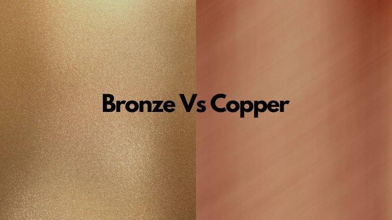
Visually, copper’s color is a striking balance of warm red and earthy brown tones, often described as a glowing metal kissed by the sun. Its hex code typically falls around #B87333, showcasing that unmistakable burnished warmth. This unique color makes copper stand out in warm metallic color palettes, pairing beautifully with neutrals and deep blues for elegant contrast.
One of copper’s most fascinating traits is its natural patina evolution. When exposed to air and moisture, copper gradually develops a soft greenish-blue layer that tells a story of time and transformation. This patina adds character and depth, turning any copper piece into a living, breathing artwork.
From practical insights, copper’s warmth and versatility make it popular in a wide range of applications—from interior accents that add cozy refinement to jewelry and decorative crafts that harness its glowing appeal. Its ability to age gracefully while maintaining its rich color makes copper a favorite for those who appreciate both tradition and trend.
Decoding Bronze Color Depth Durability and Subtle Elegance
Bronze color has a rich, warm appeal that sits between brown and gold tones, offering a subtle elegance that’s both timeless and versatile. Unlike copper, which leans more toward a reddish brown, bronze features deeper, earthier shades thanks to its alloy composition—mainly copper mixed with tin and sometimes small amounts of other metals. This blend gives bronze its unique color profile, often described as a muted gold brown with bronze shade variations depending on the exact mix.
When it comes to durability, bronze stands out. Its alloy nature makes it harder and more resistant to corrosion compared to pure copper. Over time, bronze develops a beautiful metallic patina that ranges from dark brown to greenish hues, adding character without compromising strength. This natural aging dynamic gives bronze a lived-in look many people find appealing.
Key advantages of bronze color include:
- Durability: Resistant to wear and corrosion, ideal for long-lasting use
- Elegant tones: Offers warm metallic color palettes that blend well in both modern and antique metal hues
- Visual richness: Bronze color undertones create depth and subtlety that’s less flashy than copper
- Aging beauty: Patina color transformation adds natural charm over time
Understanding these points makes bronze a go-to choice when you need metal accents that combine strength with understated beauty, whether in design, fashion, or industrial applications.
Copper vs Bronze Color Head to Head Comparison
When deciding between copper vs bronze color, understanding their key differences helps you choose the right look for your project.
Side by Side Table
| Feature | Copper Color | Bronze Color |
|---|---|---|
| Base Metal | Pure copper | Alloy of copper and tin (sometimes with other metals) |
| Typical Hue | Reddish brown with a fiery glow | Warm gold brown with subtle red undertones |
| Patina Development | Turns greenish over time (verdigris) | Darkens to deep brown or greenish shades |
| Visual Weight | Brighter, more reflective | Softer, muted metallic shine |
| Common Uses | Decorative accents, electrical | Statues, medals, hardware, industrial tools |
| Color Hex Code | #B87333 (approximate copper) | #CD7F32 (classic bronze) |
Differentiation Tips
- Copper shines with a bright reddish-orange tone that stands out with warmth and energy.
- Bronze leans towards a deeper, more muted gold-brown shade, offering subtle elegance rather than boldness.
- Copper develops a blue-green patina over time, while bronze usually ages into darker, earthy tones.
- Use copper when you want a metal with a lively, radiant look.
- Choose bronze for a timeless, understated feel with a vintage touch.
Common Pitfalls
- Confusing the two colors leads to design clashes—copper’s bright reddish look may not blend well with bronze’s muted gold brown.
- Ignoring patina development can surprise you—copper’s verdigris might not suit every decor or product style.
- Relying solely on photos or cheap finishes often hides the subtle yet important hues that separate copper vs bronze color.
Sustainability Angle
- Both copper and bronze are highly recyclable, which makes them eco-friendly choices for green-conscious buyers.
- Bronze, being an alloy, often uses recycled metals in factories, especially in places like China where customization and sustainable manufacturing are growing trends.
- Choosing either metal color for your product or space supports durability, reducing the need for replacements.
By keeping these points in mind, you can confidently pick copper or bronze color that fits your style and sustainability goals perfectly.
Real World Applications Where Copper and Bronze Shine
Copper and bronze both bring unique charm and functionality across many fields, making them popular choices in the U.S. Here’s where these warm metallic colors truly stand out:
Interior Design
- Copper color accents add a fiery, inviting glow to spaces, perfect for modern kitchens with copper sinks or lighting fixtures.
- Bronze shades offer subtle elegance in door handles, lamps, and hardware, adding vintage or rustic vibes without overwhelming.
- Both metals develop patina over time, giving furniture and decor a natural antique metal hue that fits well with warm metallic color palettes.
Art and Crafts
- Artists love working with copper for its bright reddish brown liveliness and easy customization, particularly in sculptures and jewelry.
- Bronze, known for its durability and classic gold brown undertones, is favored for statues and coins, holding detail exceptionally well.
Fashion and Beauty
- Copper tones appear in accessories and makeup palettes, complementing a wide variety of skin tones with their rich glow.
- Bronze color undertones add a chic, understated warmth in watches, belts, and even bronzing cosmetics, blending natural elegance with durability.
Industrial Uses
- Copper’s excellent conductivity keeps it in high demand for wiring and electronics, with the copper color hex code easily identifiable for quality control.
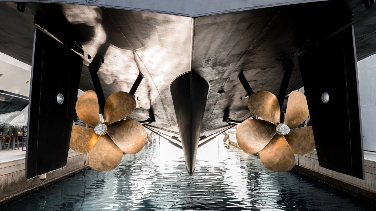
- Bronze’s strength and resistance to corrosion make it ideal for heavy-duty fittings, bearings, and marine hardware – combining style with long-lasting performance.
Both copper and bronze deliver a blend of beauty and practicality, fitting different needs while enhancing everyday items with their unique colors and metal properties. Whether you choose glossy copper or matte bronze, their real-world uses prove why these metals remain timeless.
Design Tips Mastering Copper vs Bronze in Your Space
When working with copper vs bronze color in your home or office, getting the balance right can make a big difference. Both colors add warmth and character but use them thoughtfully for the best results.
Pairing Strategies
- Copper color with its fiery reddish-brown tone works great with cool blues, greens, or soft neutrals. It adds a pop of warmth without overwhelming the space.
- Bronze shades lean more toward muted gold-brown with subtle metallic undertones, pairing nicely with earth tones like olive, beige, or charcoal gray for a cozy, sophisticated vibe.
- Mix copper and bronze accents carefully—too much can clash, but used together they create depth in warm metallic palettes.
Sourcing and Maintenance
- Look for authentic copper or bronze finishes from trusted China factories known for quality and customization options. Many U.S. suppliers offer custom color mixes to match your design needs.
- Keep metals looking fresh by cleaning with mild soap and water. Avoid harsh chemicals to protect the metallic patina development that gives these metals their antique charm.
- Regular light polishing can restore shine but embrace patina color transformation if you want a vintage look.
Trend Forecast
- Copper remains popular in interior design accents like lighting and fixtures for its bold, bright presence.
- Bronze is gaining favor in minimalist and rustic styles, thanks to its understated elegance and bronze color undertones that blend well with natural materials.
- Expect more mixed-metal designs using copper and bronze together, especially in custom furniture and decor pieces designed in the U.S. market.
Mastering copper and bronze starts with understanding their unique vibes and how to care for them. That way, your space can shine and stay timeless for years ahead.